Isolating component development with Storybook and Stencil
When authoring components, often it becomes hard to keep track of them as the number increase. There are many aspects to a component. We have to take care of usability, how it adapts in many devices sizes and browsers, and accessibility. To name a few.
In this article, we’ll see how to use Storybook to isolate the development of components. We’ll use it together with Stencil.
Storybook
Storybook is an open source tool for developing UI components in isolation for React, Vue, and Angular. It makes building stunning UIs organized and efficient.
As described by Storybook’s headline, that’s what we need. Organization and efficiency.
Adding Storybook to Stencil
Stencil is just a compiler. It generates compliant and native web components. Being a regular HTML component we can use Storybook for HTML. It will integrate with Stencil just fine.
We start by adding the required packages to our project:
npm install @stroybook/html — save/dev
Storybook has a peer dependency with @babel/core and babel-loader, so let’s add those as well:
npm install babel-loader @babel/core --save-dev
The next step is to add an NPM script to run Storybook. We’ll add the option -s to the script pointing it to our Stencil project dist folder. Let’s do it:
scripts: {
  "storybook": "start-storybook -s ./dist -p 6006"
}
Now when we run npm run storybook, it will start our Storybook server on port 6006. This is all we need to enable Storybook in our project. Soon we’ll see how to play with it.
Writing a story
A story is how we show the many facets of our components within Storybook. To do that, we need a file where we can describe how each facet behaves. The convention says we should add a file alongside with our component, this way:
sb-emojitton
|- sb-emojitton.css
|- sb-emojitton.e2e.ts
|- sb-emojitton.stories.ts
|- sb-emojitton.tsx
Take a look at how our sb-emojitton.stories.ts file is placed. The convention says we add .stories.ts to our story files organize as above.
The component we’re using is a simple button that accepts emojis. It can be represented this way:
<sb-emojitton emoji="😀" text="Smile"></sb-emojitton>
The story we want to tell is how this button behaves when the emoji is positioned to the left and the right. Let’s see what is inside sb-emojitton.stories.ts.
export const emojiToTheLeft = () =>
  '<sb-emojitton emoji="😀" position="prepend" text="Smile"></sb-emojitton>';

export const emojiToTheRight = () =>
  '<sb-emojitton emoji="😀" position="append" text="Smile"></sb-emojitton>';

export default { title: 'SB Smojitton' };
In the snippet above, each exported const will represent a facet of our component. We can add as many as we want to explore the different configuration our component has. Also, there is the possibility to have add-ons installed. The knobs allows us to edit properties dynamically.
Okay, now we have our first story written.
Exposing Stencil components
One extra step we need is to say where Storybook can find the stories we write and Stencil’s components. We do that in two steps:
First, we create a folder at the root of our project called .storybook. We also add a main.js file within that folder. This script will be responsible to load any stories within our src folder:
module.exports = {
  stories: ['../src/**/*.stories.[tj]s'],
};
Second, we’ll add a file named preview-head.html to our .storybook folder. This file will point to Storybook where to find our compiled components. Here’s the content:
<head>
  <script type="module" src="/storybook/storybook.esm.js"></script>
  <script nomodule="" src="/storybook/storybook.js"></script>
</head>
That’s all we need to expose Stencil’s components to Storybook. In the next section, we’ll see how it looks 😀.
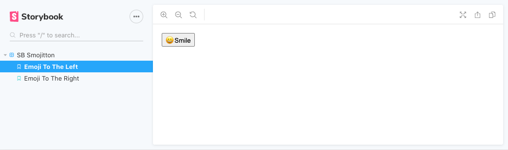
The result
Alright, once we ran npm build, we can go ahead and see our work by running npm run storybook. This will start Storybook`s UI where we can navigate through our stories.
Here is our smile positioned to the left:
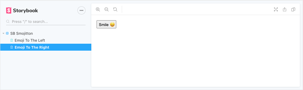
And to the right:
That would be all for this post! As always, the source code is available on GitHub.
Thank you for reading!